Qlik Sense Tutorial for Beginners
What is Qlik Sense?
Qlik Sense is a visual analysis platform that unlocks the potential of every user to harness information and uncover insight. Users of all types and skill levels can generate the insight they need to instantly answer questions and solve problems in their lines of business, problems that require much more than just an initial overview of information.
Qlik Sense is different from QlikView by owned by same company Qlik. With Qlik Sense, users of any skill level are empowered to follow their own paths to insight. Through the Associative Experience, you can ask question after question, from any object, in any direction, using simple selections and searches. Qlik Sense provides instant feedback on associated and unrelated data and updated analytics after every step. The result is a vehicle for discovery that delivers the right insight at all stages of the exploratory process.
Qlik Sense is self-service visualization tool, enabling users to rapidly create dashboards and explore complex data without being hindered by technical limitations and predefined paths.
How does Qlik Sense work?
At the heart of Qlik Sense is a patented in-memory software engine that generates new views of information on the fly. Each time a user clicks, the Qlik Sense engine instantly responds with a newly calculated set of data associations and visualizations, specific to the user’s selections. If you are a non-technical user, this directly benefits you, because you are not required to develop new reports or visualizations.
Where can I use Qlik Sense ?
Suppose you have a web Portal for school. In the Dashboard of portal under parents login, You want to show a chart of their child performance status in past three months. Here you can use Qlik Sense, The only thing you have to do is to create chart on qlik server and make the connection of your web server to Qlik Sense Server. Now using the chart Id in Qlik Sense server, You can directly load the chart where ever you want.
How to access Qlik Sense?
If you need to learn Qlik Sense , First thing you have to do is download desktop version of Qlik Sense. When you go for download you have to fill a Registration form and go for email verification. Install the setup of Qlik Sense Desktop. Its really simple just like to install a setup of ordinary application. Congratulation on your setup.
If Qlik Sense Desktop is installed then you are ready to start. Start Qlik Sense Desktop from the shortcut on your desktop, through the Start menu. While opening it will ask you to log in. You can create an user in Qlik single sign on portal and keep it with you because it will be asked every time you enter in to Qlik Sense.
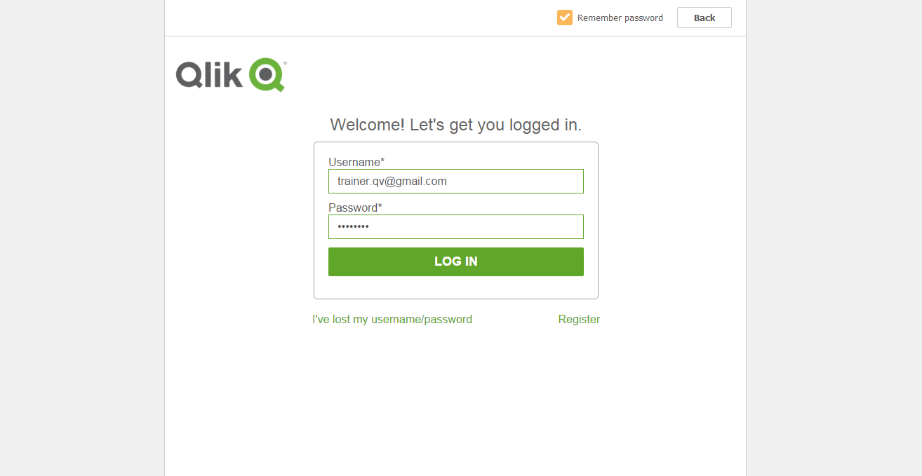
(Qlik Sense Login Page)
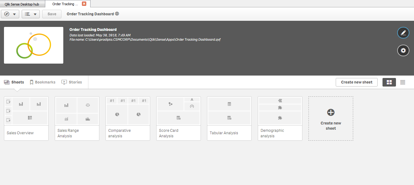
When you start Qlik Sense Desktop, you arrive at the hub. You can close the greeting message. The hub is repository where you find all your apps. If you have placed the app in the Apps folder, you should see it in your hub.

(Qlik Sense Hub)
Opening a Qlik Sense app
The app overview is opened. You are now inside the app and can see the content of the app. By default, the app overview shows the sheets of the app. In the app there are six sheets. It is in the sheets that you do most of the work, especially if you primarily are a business user and not a developer. Click to open a sheet.
Opening a Sheet
This is the insight of Qlik sense sheet. Which contain multiple visualization objects and filters in the left side menu.

(Qlik Sense Sheet)
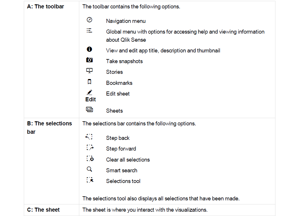
It is in the sheets that you explore, analyze, and discover the data. It is also where you create, design, and structure the visualizations when you build apps. The sheet view has three sections: the toolbar, the Selections tool, and the sheet. When you are editing a sheet there are panels on both sides of the sheet.
Visualizations of Qlik Sense
Different visualizations serve different purposes. The point of a visualization in general is to communicate its data in a quick and meaningful way while remaining 100% accurate. Let us have a look at the visualizations in the app.
- Filter panes
In the sheet Dashboard, there are two filter panes to the left: the time filter pane without title and Region. They are both filter panes, although they do not look the same. Region contains only one dimension, and shows the dimension values in a list. The time filter pane contains four dimensions, and because the space is limited, the lists are all compressed to panes. The purpose of the filter panes is to filter out a limited data set, which you can analyze and explore.
- Pie chart
Pie charts show the relationship between values as well as the relation of a single value to the total. Each sector represents a value, and as long as there are a limited number of values (less than 10), you get a good overview of the relative size of the sectors. The values are ordered by size.
- Bar chart
Below the pie chart is a bar chart, Top 5 Customers. Bar charts are useful when you want to compare
multiple values. The bars give information about the relationship between different values. Bars can be
grouped or stacked, and be displayed horizontally or vertically.
- Combo chart
Combo charts are usually used for displaying trends with bars and lines in the same visualization. A combo chart is especially useful when you want to combine values that normally are hard to combine, because they have totally different scales. The solution in the combo chart is to have two axes for the measures. In Sales Trend, the combo chart combines sales figures (millions of dollars, on the left axis) with margin (percent, on the right axis).
- KPI
To the right of the pie chart is a KPI visualization, Total Sales and Margin. It can be very useful to track performance. In a KPI visualization, you can show one or two measure values with text labels. You can add conditional colors and symbols to the values.
- Gauge
To the right of the KPI visualization is a gauge, Profit Margin. A gauge is used to display a single key measure value. In this case it is the profit margin. The colors reinforce the interpretation of the value.
- Line chart
The final visualization is a line chart, Quarterly Trend. Line charts are often used to show trends, and here there are two dimensions, year and quarter that displays the trends for each quarter of the years 2012-2014.
- Map
The fourth sheet, Customer Location, contains three filter panes and one new visualization: a map. In Qlik Sense you can create two types of maps, point maps and area maps. The map we are using in this tutorial is a point map. A point map is created using point coordinates (latitude and longitude) to mark places of interest, for example cities. Maps can, for example, be used for plotting sales data per region or per location. The map in this tutorial is used to show customer locations. You can filter by Region, City, or Customer. You can also make selections directly in the map by either clicking on a point or by using the lasso tool to select an area. If you hold down Shift before you make a selection you can select several areas to analyze.
Qlik Sense Interfaces:
Apart from visualization, Qlik sense has various interfaces as shown below, which we need to understand:

- App Overview: It is the page where we can see all the sheets in the dashboard
- Data Manager: If you want to see the data inside the tables or data model you can access data manager
- Data Load editor: Here we write data base codes and loading statements
- Data Model Viewer: Here we can see the table schema and relationships in a visual console
- Open Hub: Through this we can open Qilk Sense hub through which we can access to web based dashboard development platform.
I hope you would have liked the topic. For more such interesting topics keep connected and finally lets be friends.


